Why A Mobile Friendly Website Is Essential
Mobile browsing has been essential for many years now, with the trend growing faster than some other behaviours which came before it. If you’re a web designer or developer, you already know how important it is to provide content that’s easy and seamless to use on mobile devices such as tablets and phones. Not only will this make browsing easier for your audience members, but it’ll also help boost your conversion rates.
Why mobile usage is now exceeding desktop
I remember when I was in secondary school and all a phone could do was text and make calls. Even now it seems hard to imagine a world without mobile phones! We use them for so many things including social media, email, banking and shopping. They’ve become such an integral part of modern life that almost everyone has one.
Mobile browsing is another convenient way to access the web on-the-go. If you’re commuting to and from work or if you happen to be around town, chances are that you will have a mobile device like a tablet which you can use to stay connected to the internet. Mobile devices make it easy for us to pass time efficiently by reading the latest news or chatting with friends and family members. In 2020 the average user spent around 4 hours 20 minutes on their mobile phone per day. That is around a quarter of the time they are awake, so utilising this time to attract or gain customers and earning revenue seems like a miss opportunity. This is just one reason why it is so important to have a mobile friendly website that provides a fantastic user experience for your customer.
Why not having a mobile friendly website will hurt your business
If your site isn’t mobile-friendly, then people won’t be able to locate what they’re looking for or easily see what you have to offer. Navigating, browsing, and clicking on links will become a hassle while searching around in their browser with this much of extra work required just to find and click on a specific link. You could miss out on business and customers who are done with taking one look at the non-responsive site and leave right away. If your potential customer is so accustomed to a website that is responsive and intuitive, they will naturally see a huge difference when using your website and may lose patience quickly.
Research shows 53% of customers are extremely likely to share an experience with their friends or family on social media if they have a positive one and 28% will talk about your business if they’re disappointed. In addition, on average, we spend 2 hours and 24 minutes on social media each day – that’s a lot of time to show your product or service off but unless your site is mobile-friendly, you could be missing out on this important audience entirely!
Another factor to consider is search engine optimisation (SEO). Search engines are getting smarter and one of these strategies is their ability to index your mobile site first and use it as the main source for indexing purposes. This means even if your website is optimised on desktop, if it isn’t mobile friendly then search engines such as Google will penalise your website ranking as well as impact your user experience. The solution? Use dynamic serving so that a different site is shown to your users depending on what device they’re using!
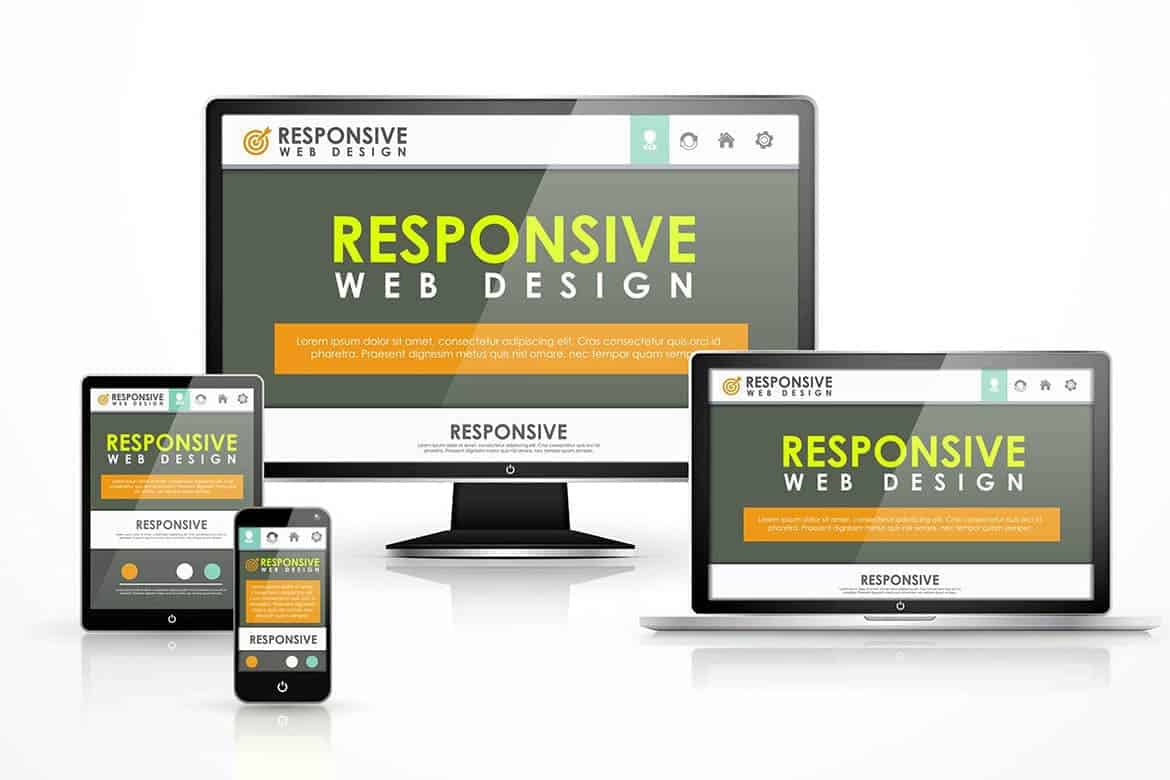
Responsive and user-friendly mobile design
Responsive web design is vital for users. This means that no matter what screen size, platform, or orientation, you’re going to see the best possible version of your favourite browser optimised for any type of device.
Here at Good Ostrich we build our website to be responsive on all devices. This means every online experience for potential customers is user friendly and easy to navigate no matter where they are or what device they are using. We also develop user friendly menus for tablet and mobile to ensure overall consistency with your website.
All websites we build not only look great but feel great too. Whether it be the content or images we ensure they are scaled and re-sized to fit across all devices so usability for the user is fast, easy and visually pleasing.
If you’re looking for a new website or maybe your current one needs a refresh, contact us today to see how we can help.